Start improving with Life QI today
Full access to all Life QI features and a support team excited to help you. Quality improvement has never been easier.
Organisation already using Life QI?
Sign-up
Creating charts to display and present data is a fundamental part of quality improvement work. They visually represent the progress of your improvement efforts and makes your data understandable.
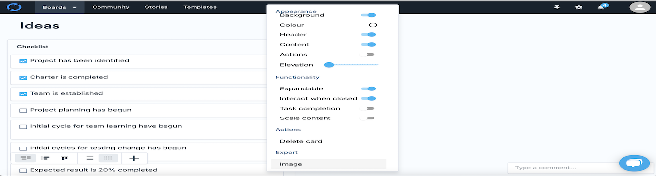
Currently the SPC charting area in Life QI is somewhat limited in scope and in some cases can cause confusion and frustration because of the lack of possibility to personalise charts. But now the charting area of Life QI is undergoing a substantial makeover!!
With the ability to add your measurements rapidly and have a full control over your charts, our new charting feature will enable you to display your data how you want and make your chart look like how you need it.
We’ve already introduced this new functionality in some earlier Labs articles, but we wanted to summarise it in one article and show you how the updated charting interface will look like.
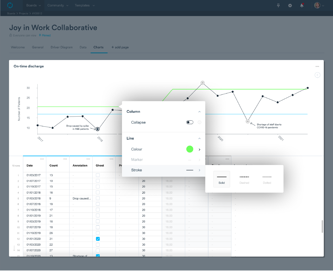
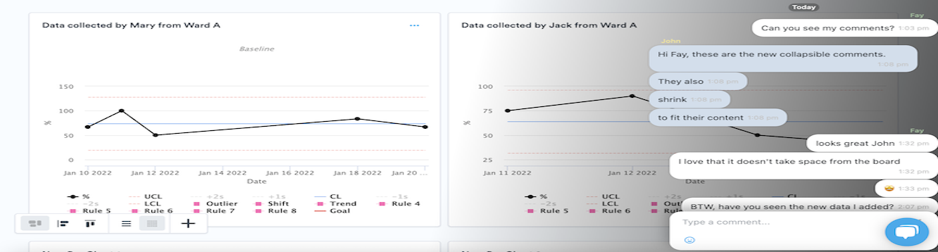
Our new chart customisation feature will let you have control over how your charts look. Yes, you’ll be able to build personalised charts so you can present your data to colleagues how you wish and help focus their attention on the elements that matter.
Available in every plan, the new custom charts development comes as a direct response to our users’ feedback. Customers told us how much they loved our existing charting functionality but the lack of ability to customise charts within projects caused duplication of effort when creating a chart. They had to export charts from Life QI and manipulate them elsewhere to achieve the desired visual result.
This got us thinking and we decided to go a step further, allowing users to create their own personalised charts. With our updated charting feature, you’ll have full control over your charts in Life QI. You’ll be able to set the colour of the lines and data points, label axis or set axis limits.
Another improvement is the ability to add goal lines to your chart so you can quickly see how your project is progressing toward that aim. You can add even more than one goal line, and differentiate them using different colours, for example.
But that’s not all. With the new functionality, Life QI allows you to add annotations to your data points to help you keep track of the changes. It can be really helpful, for example, during the baseline phase when you want to annotate outliers and exclude these special causes from the calculation of the center line and control limits. And this is where another new function, the data ghosting, comes in handy.
Full access to all Life QI features and a support team excited to help you. Quality improvement has never been easier.
Organisation already using Life QI?
Sign-up