Start improving with Life QI today
Full access to all Life QI features and a support team excited to help you. Quality improvement has never been easier.

Organisation already using Life QI?
Sign-up
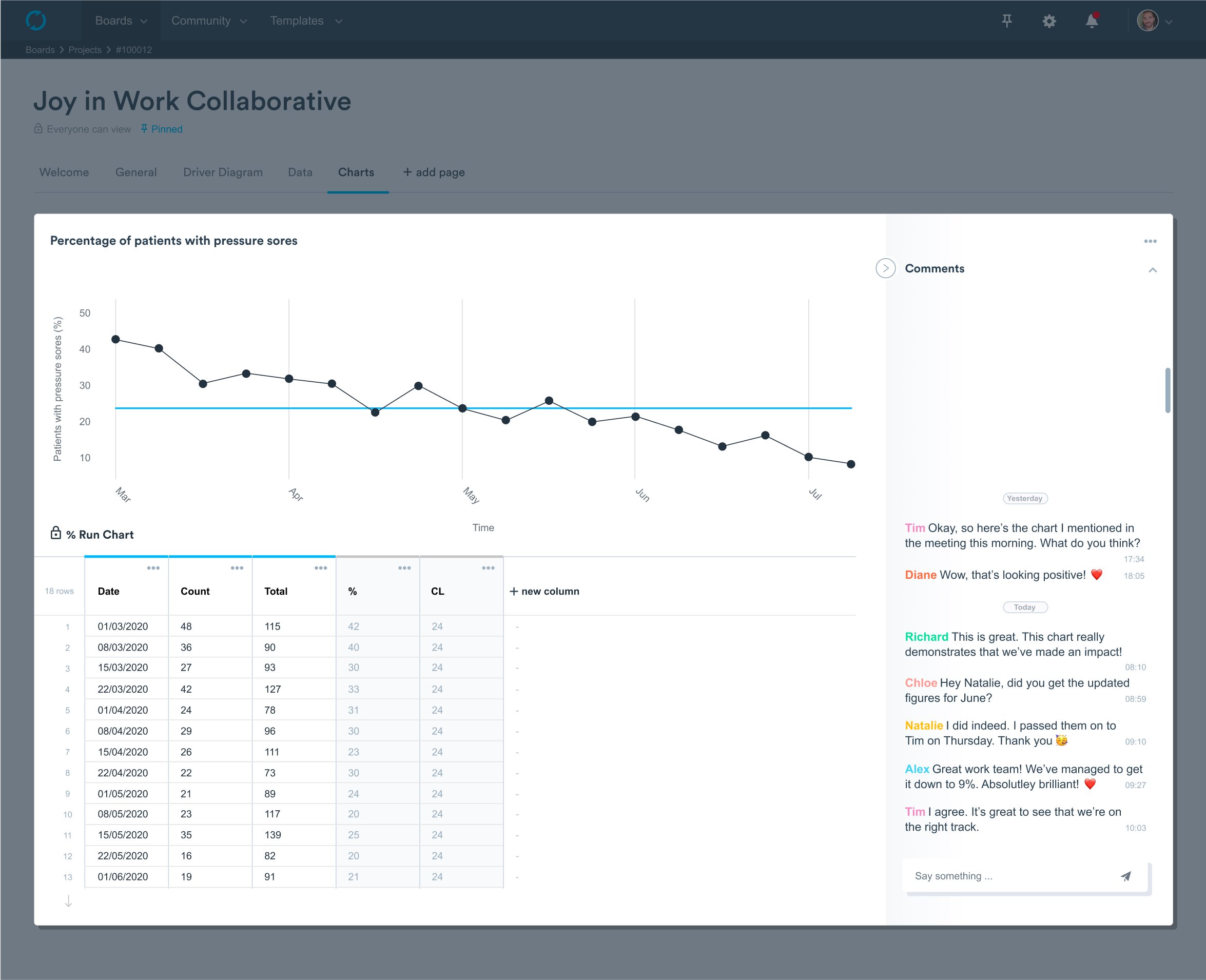
Plotting data over time is a simple method to learn from trends, patterns, and variation in data over time and to study the effect of improvement efforts. And a run chart is an easy way to detect process improvement or process degradation.
Run charts are useful aids for improving healthcare as they can be used with almost any process and with any type of data, such as measurements, counts and percentages. But to plot percentage data on a run chart in Life QI you have to calculate the percentage first and then enter that. This causes extra work for users who have the numerator and denominator but then need to do the calculation themselves – until now.
Percentage measures are very common in improvement, but not all teams want to review this data on a control chart. Sometimes a run chart is preferred. Further to which having to calculate the percentage figure yourself before entering the data to Life QI is an extra step.
We are excited to announce the launch of a new type of run chart which will allow you to enter your numerator and denominator, and it will automatically calculate and plot your percentage data on a run chart.
You can now review and analyse your percentage measures on a run chart without having to spend time calculating the percentage yourself and then entering that. This update will help you reduce the manual steps and simplify the process of data entry. This will make it easier to engage frontline teams in data analysis!
Here is an example of how it will look like:
Follow us for more feature updates!
Full access to all Life QI features and a support team excited to help you. Quality improvement has never been easier.
Organisation already using Life QI?
Sign-up