Start improving with Life QI today
Full access to all Life QI features and a support team excited to help you. Quality improvement has never been easier.

Organisation already using Life QI?
Sign-up
Bring together charts from anywhere and display them just how you want them, using Analytics.
Whether you want to analyse data from across your organisation or across a collaborative, you need it all together in one place, displayed how you like it, so you can focus on analysis. The updated charting functionality in Analytics will make it easy to have the data you need at your fingertips.
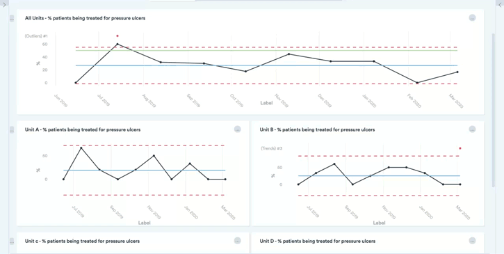
To understand the power of chart collections and aggregation, let’s look at an example of a hospital seeking to bring together select measures from projects addressing a priority area …
Perhaps you have a series of projects addressing reducing waiting times. Each project is being run in a different department or service; each of these projects is locally measuring the waiting time for their service; this data is captured and being analysed across multiple projects in Life QI.
Now you will have the ability to select those waiting time measures from across all those projects and
bring them together in a single ‘waiting times’ dashboard – showing all the charts on a single page.
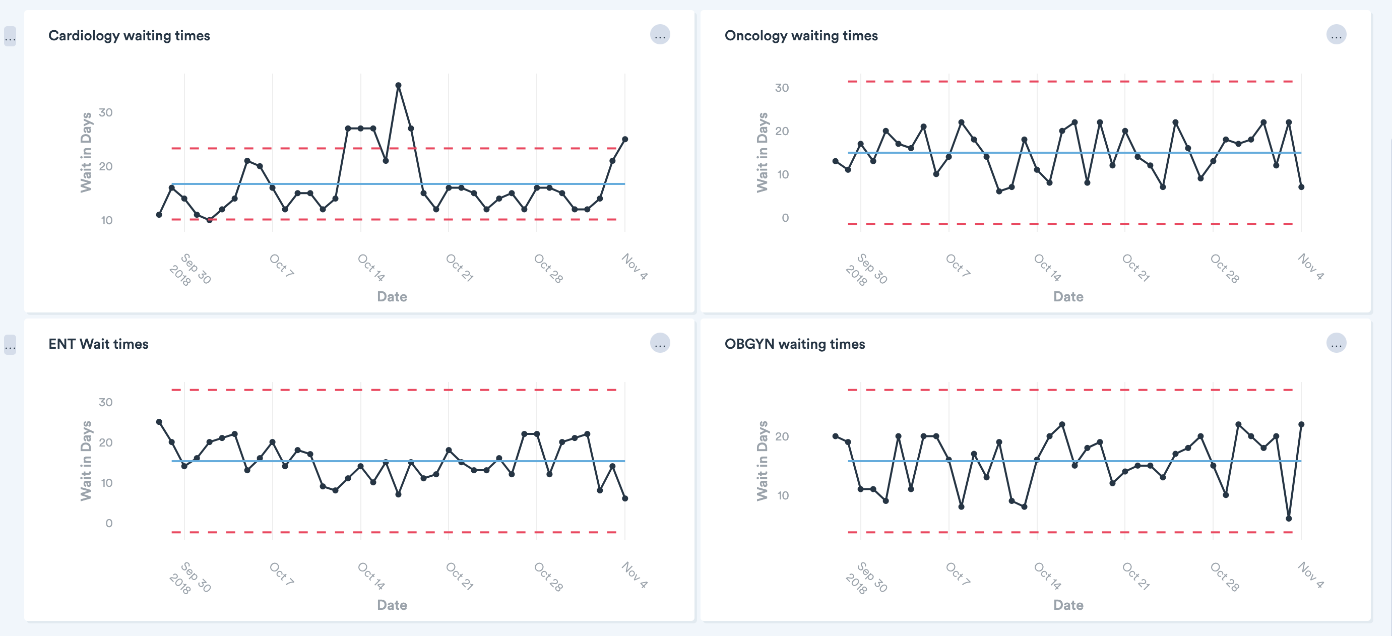
You may choose to simply have the charts all on the same page for ease of access and review. Alternatively, if you wish to compare waiting times across the services you could normalise the y-axis on all the charts so you can easily compare the data and centre lines across all charts.
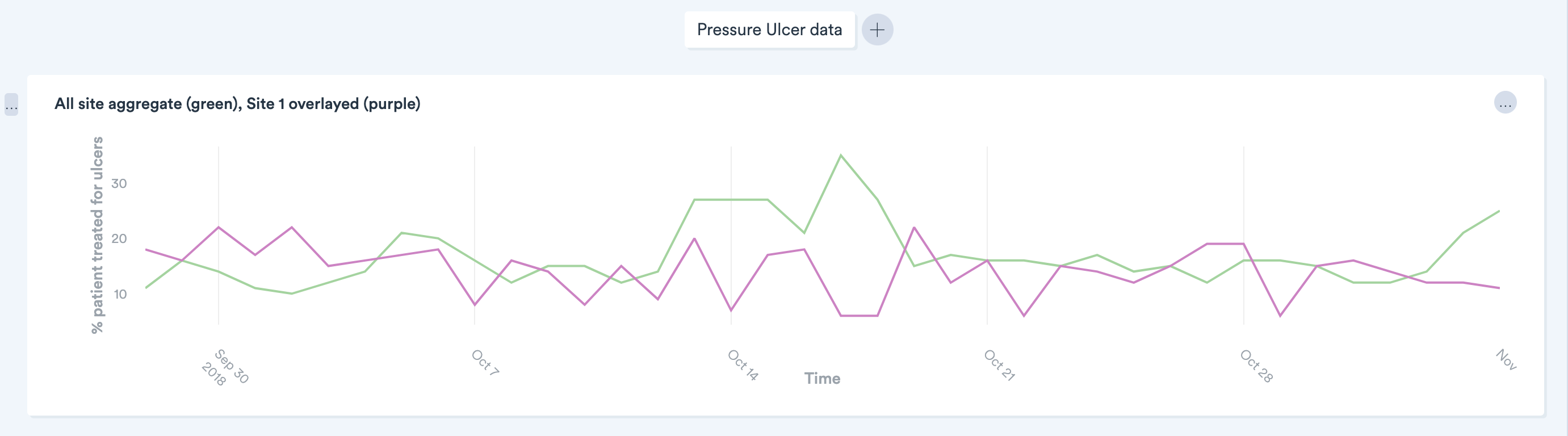
Further to this, if it made sense you could aggregate the data from all the services into a single aggregate chart. Using another example, if you were addressing pressure ulcers across the hospital you could sum the number of pressure ulcers monitored by each service to give an aggregated total over time and how it is varying. This would allow you to identify whether the improvements made within individual services had culminated in improvement significant enough to impact quality at the hospital level.
Extending this pressure ulcer example further, you could choose to display an average aggregate (average number of pressure ulcers being treated within a service), then overlay the pressure ulcer data from an individual service to show how that service is performing relative the average of all services. This is not intended as a performance management tool, but to provide insights that can be investigated. Is there a service consistently performing above average? If so, go investigate what they are doing and identify what can be applied to other services to improve their quality.
Full access to all Life QI features and a support team excited to help you. Quality improvement has never been easier.
Organisation already using Life QI?
Sign-up