Start improving with Life QI today
Full access to all Life QI features and a support team excited to help you. Quality improvement has never been easier.
Organisation already using Life QI?
Sign-up
We are thrilled to be introducing one of the most requested features – options for customising the look of your charts. This will give you control of how your charts look so you can present them to colleagues how you wish and help focus their attention on the elements that matter.
Some of the chart control options we are introducing include:
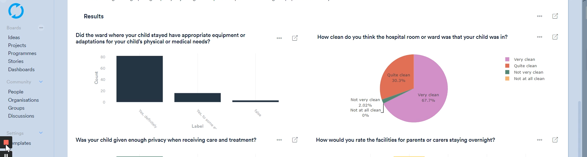
Check out these images showing a few of these new controls in action …
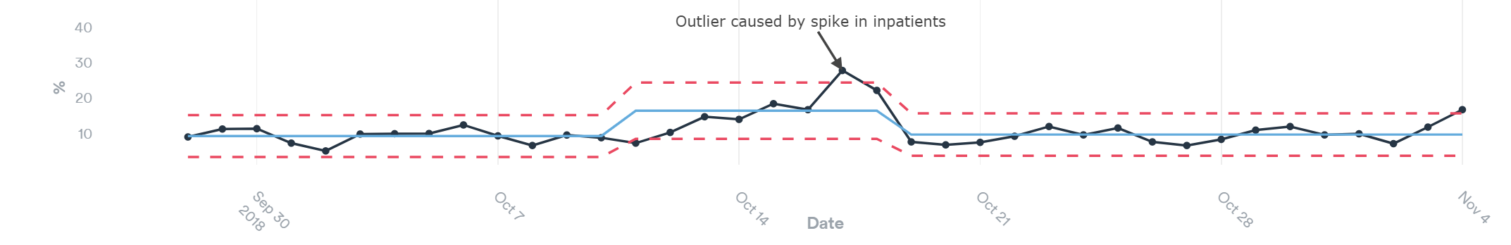
The annotations you add to specific data points will now display on the chart, allowing them to be read without having to click on the Note icon. The annotations will also appear on the chart exports.
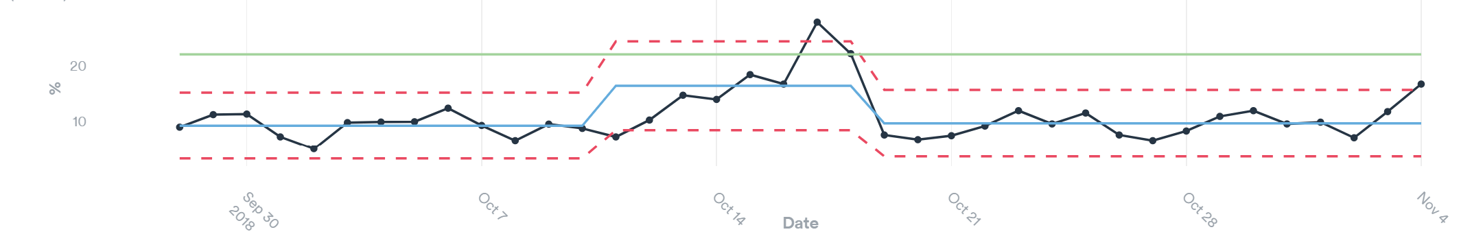
The much-requested goal lines are being introduced. This will come with the option for multiple goals and configuration options such as separate colours for each goal. Goals can also change across the timeline of the charts to represent adjustments or cumulative goals across the full period of data collection.
The new goals feature allows you to visualise the direction of improvement on the chart and progress being made towards realising that goal.
Check out this example with a single green goal line:
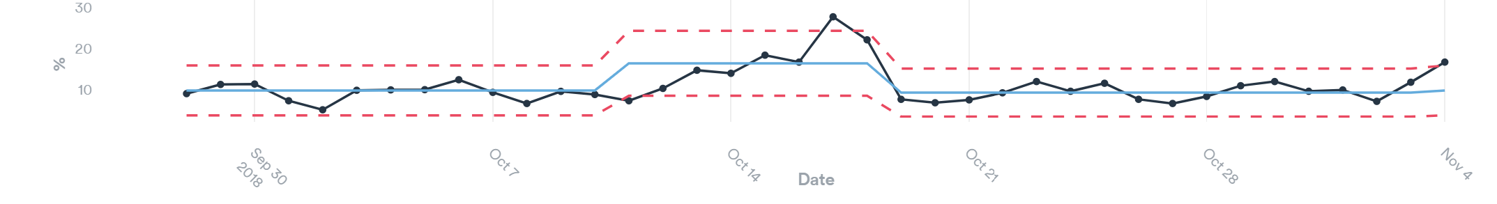
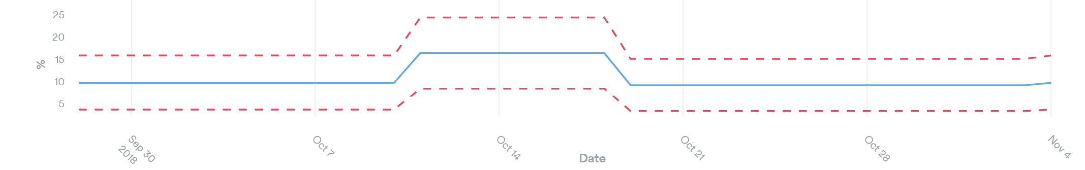
The mechanism for re-calculating the centre line and control limits (often referred to as a process break) will be changing. This screenshot gives a preview of how a chart will look once process breaks have been added. The new colours being used for the centre line and control limits make the changes far more apparent speeding up your analysis of the chart.
The new chart configuration options will allow you to toggle on and off the lines shown on the chart. This is useful if you want to focus the viewer on a particular aspect of the data and remove the elements not required in your presentation of the data.
This even applies to hiding the actual data line. The image below shows a chart with the data line hidden and just the centre lines, upper and lower control limits shown. This display makes it easier to analysis the overall variation in the process being monitored, rather than being ‘distracted’ by the data line.
Full access to all Life QI features and a support team excited to help you. Quality improvement has never been easier.
Organisation already using Life QI?
Sign-up