Start improving with Life QI today
Full access to all Life QI features and a support team excited to help you. Quality improvement has never been easier.

Organisation already using Life QI?
Sign-up
When measuring the same thing at multiple sites (which could be wards/units within a single hospital, or multiple hospitals within a country) you often want to compare the data between sites. How does each site compare to one another? Which site is seeing the greatest level of improvement? Are there any common trends emerging across all sites?
Answering these questions and more is possible with the new ‘small multiples’ measure view in Life QI. This allows you to bring together all charts for a single measure on one page. As well as having all the charts visible on the same page you can control the order and size of the charts to help highlight specific charts that you want to draw attention to.
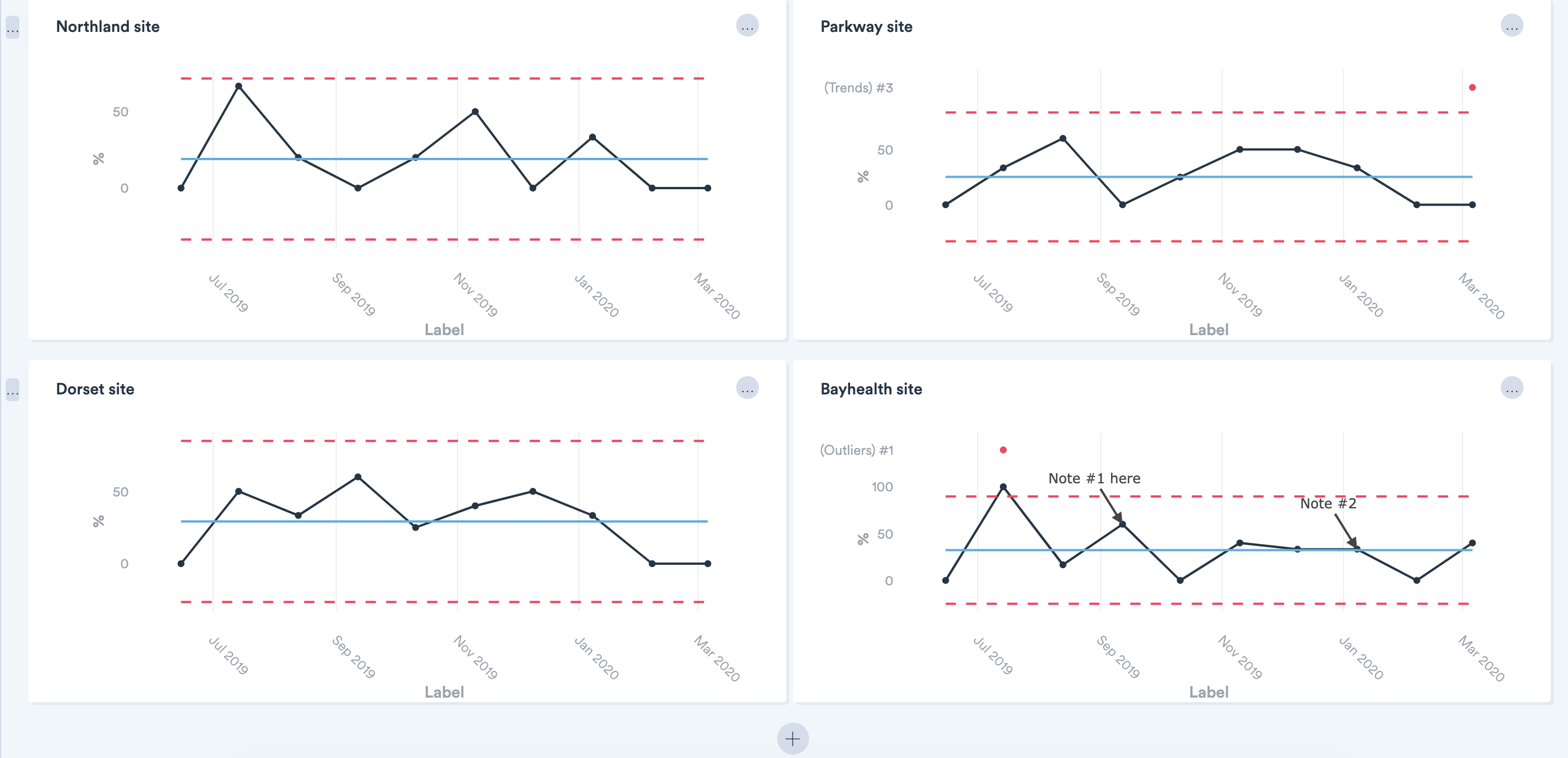
Further to having all the individual charts laid out on the same page, the small multiples view also allows you to aggregate the data from all those charts onto a single chart to monitor the total variation happening across all sites. You can even control which type of aggregation you want – i.e. display the sum or average of all the individual charts. Furthermore, you can choose to display the data line from individual charts on the aggregate chart to allow comparison of how a site is doing compared to the average across all sites.
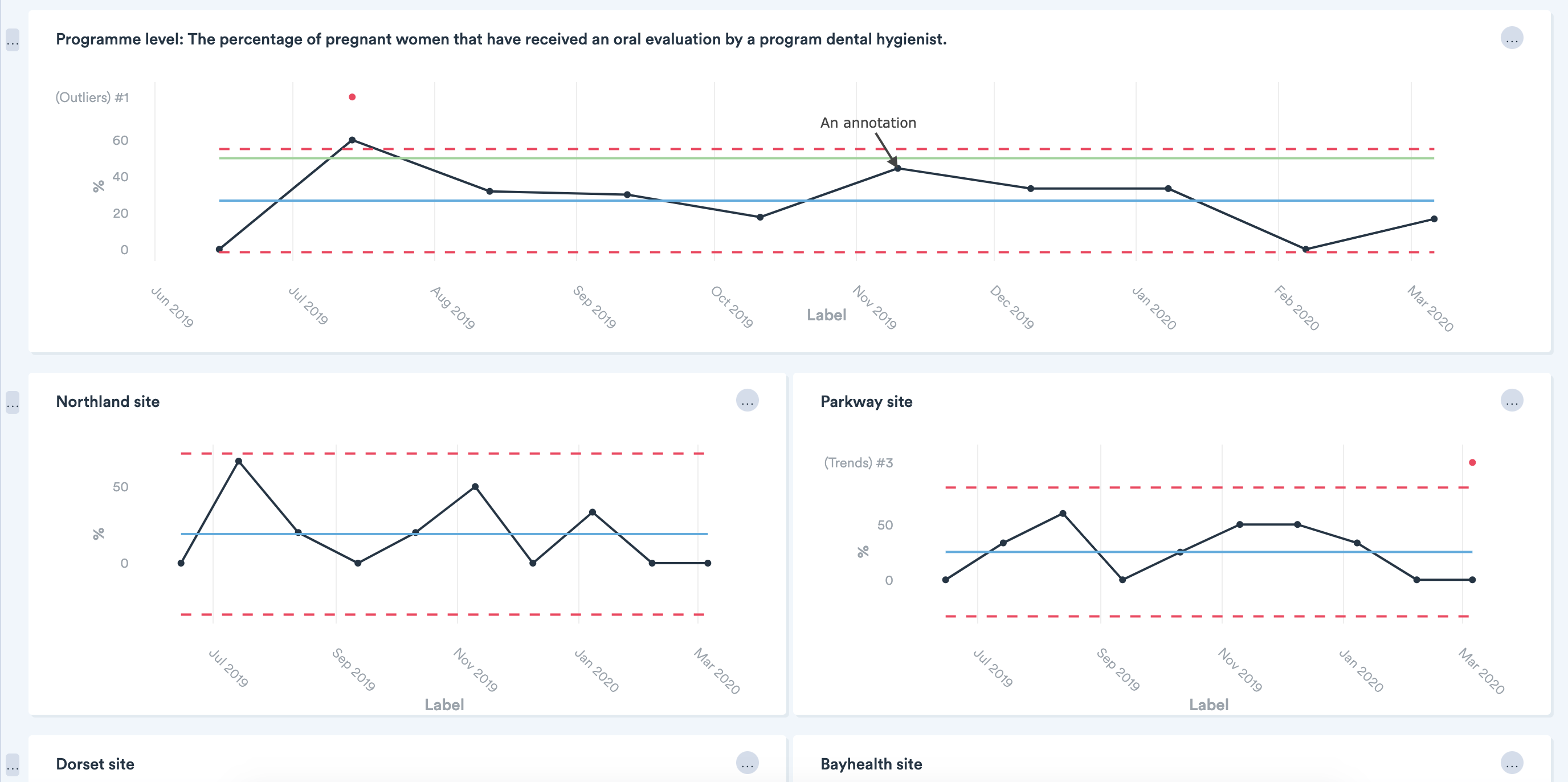
This small multiples and aggregation functionality is great for reviewing and comparing data from multiple teams taking part in a collaborative. Another typical scenario for small multiples would be a single project collecting data from multiple sites/units/wards. The same functionality could be used to allow you to see, compare and aggregate data within your project.
Full access to all Life QI features and a support team excited to help you. Quality improvement has never been easier.
Organisation already using Life QI?
Sign-up