Start improving with Life QI today
Full access to all Life QI features and a support team excited to help you. Quality improvement has never been easier.
Organisation already using Life QI?
Sign-up
Run charts and Control Charts are often seen as the staple of measurement for improvement, and have been a key feature of Life QI since its beginning. The latest release will see a number of improvements to the usability, visualisation and customisation of these – you can read about that here.
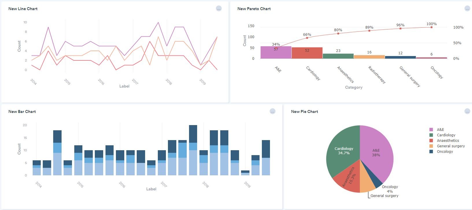
The release also sees the addition of new charts. For the first time, Pareto Charts will be available to help facilitate root cause analysis of a problem. You can read more about our new Pareto Charts tool here.
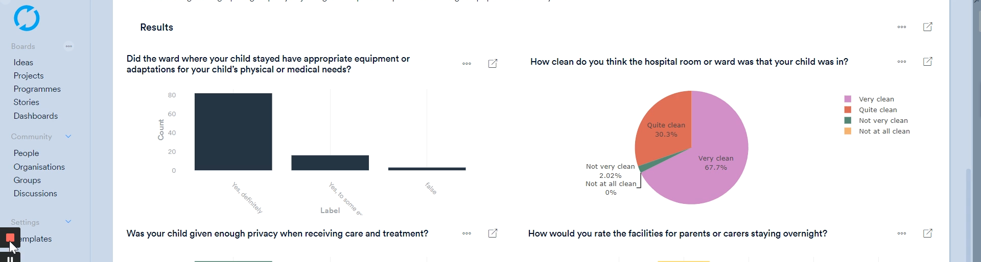
User feedback tells us that, in some scenarios, a simpler approach to visualising data is preferred. As a result, you will now be able to select Line Charts, Bar Charts and Pie Charts to help visualise your datasets. These use the same interface as the other charts and just provide a few more options for displaying your data. Now you can visualise all your improvement datasets in one place!
Check out this image of some of our new charts…
Full access to all Life QI features and a support team excited to help you. Quality improvement has never been easier.
Organisation already using Life QI?
Sign-up